Tooltip
17 Feb 202212 minutes to read
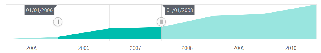
The tooltip for sliders are supported by the Range Selector. Sliders are used in the Range Selector to select data from a specific range. The tooltip displays the selected start and end values.
Enable Tooltip
The tooltip can be used to display information about the selected data and it is enabled by setting the enable property to true.
@{
    var value = new object[] { new DateTime(2005, 05, 01), new DateTime(2010, 1, 31) };
}
<ejs-rangenavigator id="rangeNavigator" valueType="DateTime" labelFormat="MMM-yy" value="value">
    <e-rangenavigator-tooltip enable="true" displayMode="Always">
    </e-rangenavigator-tooltip>
    <e-rangenavigator-rangenavigatorseriescollection>
        <e-rangenavigator-rangenavigatorseries xName="x" yName="y" dataSource="ViewBag.dataSource" type="Area" width=2>
        </e-rangenavigator-rangenavigatorseries>
    </e-rangenavigator-rangenavigatorseriescollection>
</ejs-rangenavigator>
public ActionResult Index()
{
List<data> dataSource = new List<data>
{
new data { x = new DateTime(2005, 01, 01), y = 21, y1 = 28 },
new data { x = new DateTime(2006, 01, 01), y = 24, y1 = 44 },
new data { x = new DateTime(2007, 01, 01), y = 36, y1 = 48 },
new data { x = new DateTime(2008, 01, 01), y = 38, y1 = 50 },
new data { x = new DateTime(2009, 01, 01), y = 54, y1 = 66 },
new data { x = new DateTime(2010, 01, 01), y = 57, y1 = 78 },
new data { x = new DateTime(2011, 01, 01), y = 70, y1 = 84 },
};
ViewBag.dataSource = dataSource;
return View();
}
public class data
{
public DateTime x;
public double y;
public double y1;
}
Customization
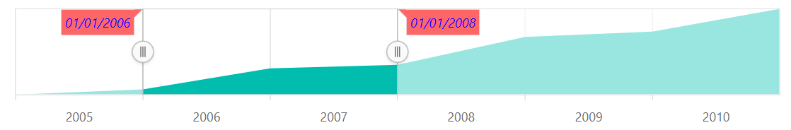
Tooltip can be customized using the following properties:
- enable - Customizes the visibility of the tooltip.
- fill - Customizes the background color of the tooltip.
- opacity - Customizes the opacity of the tooltip.
- textStyle - Customizes the font size, color, family, style, weight, alignment, and overflow of the tooltip.
@{
     var value = new object[] { new DateTime(2005,05,01), new DateTime(2010,1,31) };
      var textstyle = new { style="Italic", color="blue", size="12px"};
    }
 <ejs-rangenavigator id="rangeNavigator" valueType="DateTime" value="value" >
                <e-rangenavigator-tooltip enable="true" displayMode="Always" fill="red" opacity="0.6" textStyle="textstyle">
                </e-rangenavigator-tooltip>
                <e-rangenavigator-rangenavigatorseriescollection>
                    <e-rangenavigator-rangenavigatorseries xName="y" yName="y1" dataSource="ViewBag.dataSource" type="Area" width=2>
                    </e-rangenavigator-rangenavigatorseries>
                </e-rangenavigator-rangenavigatorseriescollection>
</ejs-rangenavigator>
public IActionResult Index()
{
List<data> dataSource = new List<data>
{
new data { x = new DateTime(2005, 01, 01), y = 21, y1 = 28 },
new data { x = new DateTime(2006, 01, 01), y = 24, y1 = 44 },
new data { x = new DateTime(2007, 01, 01), y = 36, y1 = 48 },
new data { x = new DateTime(2008, 01, 01), y = 38, y1 = 50 },
new data { x = new DateTime(2009, 01, 01), y = 54, y1 = 66 },
new data { x = new DateTime(2010, 01, 01), y = 57, y1 = 78 },
new data { x = new DateTime(2011, 01, 01), y = 70, y1 = 84 },
};
ViewBag.dataSource = dataSource;
return View();
}
public class data
{
public DateTime x;
public double y;
public double y1;
}
Label Format
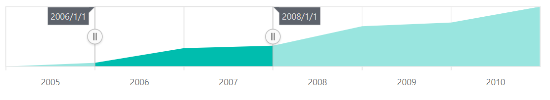
The labelFormat property in the tooltip is used to format and parse the date to all globalize formats.
<ejs-rangenavigator id="rangeNavigator" valueType="DateTime" >
                <e-rangenavigator-tooltip enable="true" displayMode="Always" format="MMM/yy" >
                   </e-rangenavigator-tooltip>
                <e-rangenavigator-rangenavigatorseriescollection>
                    <e-rangenavigator-rangenavigatorseries xName="y" yName="y1" dataSource="ViewBag.dataSource" type="Area" width=2>
                    </e-rangenavigator-rangenavigatorseries>
                </e-rangenavigator-rangenavigatorseriescollection>
</ejs-rangenavigator>>
public IActionResult Index()
{
List<data> dataSource = new List<data>
{
new data { x = new DateTime(2005, 01, 01), y = 21, y1 = 28 },
new data { x = new DateTime(2006, 01, 01), y = 24, y1 = 44 },
new data { x = new DateTime(2007, 01, 01), y = 36, y1 = 48 },
new data { x = new DateTime(2008, 01, 01), y = 38, y1 = 50 },
new data { x = new DateTime(2009, 01, 01), y = 54, y1 = 66 },
new data { x = new DateTime(2010, 01, 01), y = 57, y1 = 78 },
new data { x = new DateTime(2011, 01, 01), y = 70, y1 = 84 },
};
ViewBag.dataSource = dataSource;
return View();
}
public class data
{
public DateTime x;
public double y;
public double y1;
}
The following table shows the results of applying some common date and time formats to the labelFormat property.
| Label Value | Label Format Property Value | Result | Description |
| new Date(2000, 03, 10) | EEEE | Monday | The Date is displayed in day format |
| new Date(2000, 03, 10) | yMd | 04/10/2000 | The Date is displayed in month/date/year format |
| new Date(2000, 03, 10) | MMM | Apr | The Shorthand month for the date is displayed |
| new Date(2000, 03, 10) | hm | 12:00 AM | Time of the date value is displayed as label |
| new Date(2000, 03, 10) | hms | 12:00:00 AM | The Label is displayed in hours:minutes:seconds format |