How can I help you?
Customization of Predefined Dialogs
3 Nov 20228 minutes to read
Customize action buttons
You can customize the predefined dialogs buttons by using below properties.
-
okButton- Use this property to customize OK button text and appearence. -
cancelButton- Use this property to customize Cancel button text and appearence.
Use the following code snippet for Alert.cshtml, Confirm.cshtml and Prompt.cshtml to customize the predefined dialog action buttons.
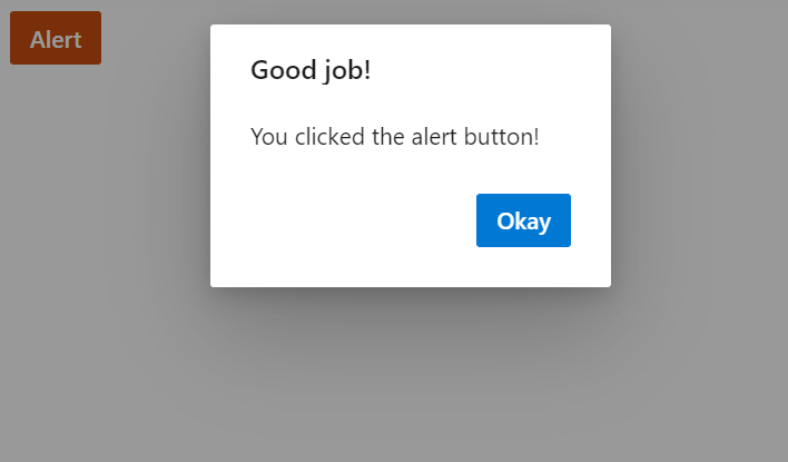
For alert dialog , customized the default dialog button content as Done by using the okButton.text property.
For confirm dialog, customized the default dialog buttons content as Yes and No by using the okButton.textand cancelButton.text property and also customized the dialog button icons by using okButton.icon property.
For prompt dialog , customized the default dialog buttons content as Connect and Close by using okButton.text and cancelButton.text property.
<div style="height:400px;">
    <ejs-button id="alertBtn" content="Alert" cssClass="e-danger"></ejs-button>
</div>

<script>
    document.getElementById('alertBtn').onclick = function () {
        ej.popups.DialogUtility.alert({
            title: "Good job!",
            content: "You clicked the alert button!",
            okButton: { text: 'Done' }
        });
    };
</script>
<div style="height:400px;">
<ejs-button id="confirmBtn" content="Confirm" cssClass="e-success"></ejs-button>
</div>
<style>
.e-btn-icon.e-icons.e-check icon.e-icon-left:before {
content: '\e7ff';
}
.e-btn-icon.e-icons.e-close icon.e-icon-left:before {
content: '\e7fc';
}
</style>
<script>
document.getElementById('confirmBtn').onclick = function () {
ej.popups.DialogUtility.confirm({
title: 'Delete file',
content: "Are you sure you want to permanently delete these file?",
okButton: { text: "Yes", icon: "e-icons e-check" },
cancelButton: { text: "No", icon: "e-icons e-close" }
});
};
</script><div style="height:400px;">
<ejs-button id="promptBtn" content="Prompt" isPrimary="true"></ejs-button>
</div>
<script>
document.getElementById('promptBtn').onclick = function () {
ej.popups.DialogUtility.confirm({
title: "Join Wi-Fi network",
content: "<table class=Table><tbody><tr><td>SSID: <b>AndroidAP</b></td></tr><tr> <td>Password:</td> </tr> <tr> <td> <span class=e - input - group> <input type=password id=password name=Required class=e - input> </span> </td> </tr> </tbody> </table>",
okButton: { text: "Connect" },
cancelButton: { text: "Close" }
});
};
</script>Results from the code snippet
Alert
Confirm

Prompt

Show or hide dialog close button
When rendering the predefined dialogs through utility methods, You can close the dialog using the following ways. The default values of closeOnEscape and showCloseIcon is false.
- By pressing the escape key if the closeOnEscape property is enabled.
- By clicking the close button if the showCloseIcon property is enabled.
You can also manually close the Dialogs by creating an instance to the dialog and call the hide method.
Use the following code for alert, confirm and prompt to demonstrates the different ways of hiding the utility dialog.
<div style="height:400px;">
    <ejs-button id="alertBtn" content="Alert" cssClass="e-danger"></ejs-button>
</div>
<script>
    document.getElementById('alertBtn').onclick = function () {
        ej.popups.DialogUtility.alert({
            title: "Low battery",
            content: "10% of battery remaining",
            showCloseIcon: true,
            closeOnEscape : true
        });
    };
</script>
<div style="height:400px;">
<ejs-button id="confirmBtn" content="Confirm" cssClass="e-success"></ejs-button>
</div>
<script>
document.getElementById('confirmBtn').onclick = function () {
ej.popups.DialogUtility.confirm({
title: "Delete multiple items",
content: "Are you sure you want to permanently delete these items?",
showCloseIcon: true,
closeOnEscape : true
});
};
</script><div style="height:400px;">
<ejs-button id="promptBtn" content="Prompt" isPrimary="true"></ejs-button>
</div>
<script>
document.getElementById('promptBtn').onclick = function () {
ej.popups.DialogUtility.confirm({
title: "Join Wi-Fi network",
content: "<table class=Table><tbody><tr><td>SSID: <b>AndroidAP</b></td></tr><tr> <td>Password:</td> </tr> <tr> <td> <span class=e - input - group> <input type=password id=password name=Required class=e - input> </span> </td> </tr> </tbody> </table>",
showCloseIcon: true,
closeOnEscape : true
});
};
</script>Results from the code snippet
Alert

Confirm

Prompt

Customize dialog content
You can load custom content in predefined dialogs using the content property.
Use the following code to customize the dialog content to render the custom TextBox component inside the prompt dialog to get the username from the user.
<div style="height:400px;">
    <ejs-button id="confirmBtn" content="Confirm" cssClass="e-success"></ejs-button>
</div>
<script>
    document.getElementById('confirmBtn').onclick = function () {
        ej.popups.DialogUtility.confirm({
            title: "Join chat group",
            content: "<p>Enter your name: </p><input class=e-input />",
            width: "350px"
        });
    };
</script>
Results from the code snippet
