Icons in Message control
27 Feb 20239 minutes to read
This section explains the message with no icons, how to show or hide the close icon and add the custom severity icon to the message.
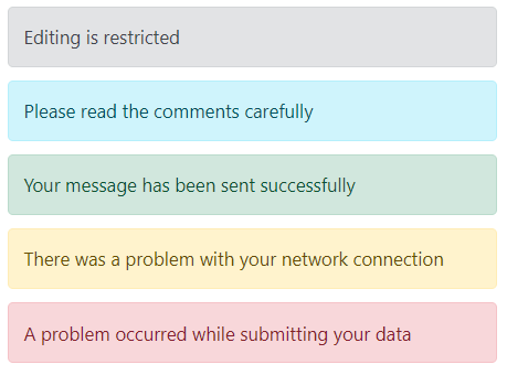
No Icon
By default, severity icons can be displayed according to the severity types to make it more understandable to the user by visual information rather than text. To hide the severity icons, set the showIcon property to false.
The following example demonstrates the different severity messages without the severity icons.
<div class="msg-default-section">
    <div class="content-section">
        <ejs-message id="msg_default" content="Editing is restricted" showIcon="false"></ejs-message>
        <ejs-message id="msg_info" content="Please read the comments carefully" severity="Info" showIcon="false"></ejs-message>
        <ejs-message id="msg_success" content="Your message has been sent successfully" severity="Success" showIcon="false"></ejs-message>
        <ejs-message id="msg_warning" content="There was a problem with your network connection" severity="Warning" showIcon="false"></ejs-message>
        <ejs-message id="msg_error" content="A problem occurred while submitting your data" severity="Error" showIcon="false"></ejs-message>
    </div>
</div>

<style>
  .msg-default-section .content-section {
    margin: 0 auto;
    max-width: 450px;
    padding-top: 10px;
  }

  .msg-default-section .e-message {
    margin: 10px 0;
  }
</style>
public class HomeController : Controller
{
public ActionResult Index()
{
return View();
}
}
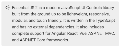
Custom Icon
By default, the severity icons can be displayed according to the severity type to make it more understandable to the user by visual information rather than text. If the user wants to customize these icons, it can be achieved through the cssClass property.
The following example demonstrates how the default message is rendered with a custom severity icon.
<div class="col-lg-12 control-section msg-custom-section">
  <div class="content-section">
    <ejs-message id="msg_icon" cssClass="custom">
      <e-content-template>
        <div>
          Essential JS 2 is a modern JavaScript UI Controls library that has been built from the ground
          up to be lightweight, responsive, modular and touch friendly. It is written in TypeScript and has no
          external dependencies. It also includes complete support for Angular, React, Vue, ASP.NET MVC and
          ASP.NET Core frameworks.
        </div>
      </e-content-template>
    </ejs-message>
  </div>
</div>

<style>
  .msg-custom-section .content-section {
    margin: 0 auto;
    max-width: 400px;
    padding-top: 10px;
  }

  .msg-custom-section .e-message {
    margin: 10px 0;
  }

  @font-face {
    font-family: 'Message_icons';
    src: url(data:application/x-font-ttf;charset=utf-8;base64,AAEAAAAKAIAAAwAgT1MvMj8BS4YAAAEoAAAAVmNtYXDopOjpAAABiAAAADZnbHlmEsNXoQAAAcgAAAJMaGVhZCGnOH4AAADQAAAANmhoZWEIPwQDAAAArAAAACRobXR4CAAAAAAAAYAAAAAIbG9jYQEmAAAAAAHAAAAABm1heHABEAEOAAABCAAAACBuYW1l1dofAwAABBQAAAJtcG9zdNGGZXAAAAaEAAAALwABAAAEAAAAAFwEAAAAAAAD4gABAAAAAAAAAAAAAAAAAAAAAgABAAAAAQAAecv2N18PPPUACwQAAAAAAN9TeeEAAAAA31N54QAAAAAD4gO/AAAACAACAAAAAAAAAAEAAAACAQIABAAAAAAAAgAAAAoACgAAAP8AAAAAAAAAAQQAAZAABQAAAokCzAAAAI8CiQLMAAAB6wAyAQgAAAIABQMAAAAAAAAAAAAAAAAAAAAAAAAAAAAAUGZFZABA6JTolAQAAAAAXAQAAAAAAAABAAAAAAAABAAAAAQAAAAAAAACAAAAAwAAABQAAwABAAAAFAAEACIAAAAEAAQAAQAA6JT//wAA6JT//wAAAAEABAAAAAEAAAAAAAABJgAAAAQAAAAAA+IDvwANAG4AoAEBAAABLwMrATUzPwQXDwMVHxIdAQ8SFR8GMz8RPQEvESMPAicHIw8HERUfDD8JES8JIw8BNw8DFR8SHQEPEhUfBj8SPQEvESMPAgHCjwYHCAelpQcIBwaPqQMCAwECAwUGCQkIBwcHBQYEBQMDAgIBAQICAwMFBAYFBwcHCAkJBgUDAgEDBQcICQkHBgcGDQwLCwoJCAcHBgUEAwICAgIDBAUGBwcICQoLCwwNBgcHBwkJB6LJvwkIBwYFBAIBAwQFBgcECMTJBgcHCAgJBQUEBAMCAQEBAQIDBAQFBQkJBwcH/QMCAwECAwUGFRQSEREODgwLCggGBgMDAwMGBggKCwwODhEREhQVBgUDAgEDBQcICQkHBgcGGBgWFBMSDw8NCwkIBgUDAwUGCAkLDQ8PEhMUFhgYBgcHBwkJBwElfwQEAqgBAgMFfwQDBAgICAgHBwYHCAkJCQkKCgsLCgwLDAsMDAsMCwwKCwsKCgkJCQkIBwYHBwgICAgHBwUDAQIDBAoMDAwNDQ4PDg8QEBAQEBEREBAQEBAPDg8ODQ0MDAwKBAMCAQMFerMBAgQFBgcECP7/CAgHBgYDAgEBsgUDAgEBAwMEBAUFBQYGAnYGBgYFBQQEAwIBAgROBAMICAgIBwcGERMTFRUWFxcYGRkaGhsbGxsbGxoaGRkYFxcWFRUTExEGBwcICAgIBwcFAwEBAQMEFRUXGBkaGxsdHR4eHx8gICAgHx8eHh0dGxsaGRgXFRUEAwIBAwUAAAAAEgDeAAEAAAAAAAAAAQAAAAEAAAAAAAEADQABAAEAAAAAAAIABwAOAAEAAAAAAAMADQAVAAEAAAAAAAQADQAiAAEAAAAAAAUACwAvAAEAAAAAAAYADQA6AAEAAAAAAAoALABHAAEAAAAAAAsAEgBzAAMAAQQJAAAAAgCFAAMAAQQJAAEAGgCHAAMAAQQJAAIADgChAAMAAQQJAAMAGgCvAAMAAQQJAAQAGgDJAAMAAQQJAAUAFgDjAAMAAQQJAAYAGgD5AAMAAQQJAAoAWAETAAMAAQQJAAsAJAFrIE1lc3NhZ2VfaWNvbnNSZWd1bGFyTWVzc2FnZV9pY29uc01lc3NhZ2VfaWNvbnNWZXJzaW9uIDEuME1lc3NhZ2VfaWNvbnNGb250IGdlbmVyYXRlZCB1c2luZyBTeW5jZnVzaW9uIE1ldHJvIFN0dWRpb3d3dy5zeW5jZnVzaW9uLmNvbQAgAE0AZQBzAHMAYQBnAGUAXwBpAGMAbwBuAHMAUgBlAGcAdQBsAGEAcgBNAGUAcwBzAGEAZwBlAF8AaQBjAG8AbgBzAE0AZQBzAHMAYQBnAGUAXwBpAGMAbwBuAHMAVgBlAHIAcwBpAG8AbgAgADEALgAwAE0AZQBzAHMAYQBnAGUAXwBpAGMAbwBuAHMARgBvAG4AdAAgAGcAZQBuAGUAcgBhAHQAZQBkACAAdQBzAGkAbgBnACAAUwB5AG4AYwBmAHUAcwBpAG8AbgAgAE0AZQB0AHIAbwAgAFMAdAB1AGQAaQBvAHcAdwB3AC4AcwB5AG4AYwBmAHUAcwBpAG8AbgAuAGMAbwBtAAAAAAIAAAAAAAAACgAAAAAAAAAAAAAAAAAAAAAAAAAAAAAAAgECAQMABWF1ZGlvAAAA) format('truetype');
    font-weight: normal;
    font-style: normal;
  }

  .custom.e-message .e-msg-icon::before {
    font-family: 'Message_icons';
    content: '\e894';
  }
</style>
public class HomeController : Controller
{
public ActionResult Index()
{
return View();
}
}
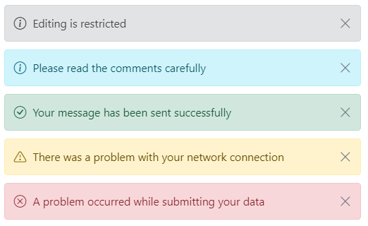
Close Icon
The message can be rendered with or without the close icon. The close icon is used to hide the message, either by manually clicking the close icon or through keyboard interaction.
By default, the close icon is not rendered in the message. To show the close icon, set the showCloseIcon property to true.
In the following example, the messages are rendered with the close icon.
<div class="msg-icon-section">
  <div class="content-section">
    <ejs-button id="btn1" content="Show Default Message" cssClass="e-outline e-primary msg-hidden"></ejs-button>
    <ejs-message id="msg_default_icon" showCloseIcon="true" closed="defaultClosed" content="Editing is restricted">
    </ejs-message>
    <ejs-button id="btn2" content="Show Info Message" cssClass="e-outline e-primary e-info msg-hidden"></ejs-button>
    <ejs-message id="msg_info_icon" severity="Info" showCloseIcon="true" closed="infoClosed"
      content="Please read the comments carefully"></ejs-message>
    <ejs-button id="btn3" content="Show Success Message" cssClass="e-outline e-primary e-success msg-hidden">
    </ejs-button>
    <ejs-message id="msg_success_icon" severity="Success" showCloseIcon="true" closed="successClosed"
      content="Your message has been sent successfully"></ejs-message>
    <ejs-button id="btn4" content="Show Warning Message" cssClass="e-outline e-primary e-warning msg-hidden">
    </ejs-button>
    <ejs-message id="msg_warning_icon" severity="Warning" showCloseIcon="true" closed="warningClosed"
      content="There was a problem with your network connection"></ejs-message>
    <ejs-button id="btn5" content="Show Error Message" cssClass="e-outline e-primary e-error msg-hidden"></ejs-button>
    <ejs-message id="msg_error_icon" severity="Error" showCloseIcon="true" closed="errorClosed"
      content="A problem has been occurred while submitting your data"></ejs-message>
  </div>
</div>

<script type="text/javascript">
  document.getElementById("btn1").onclick = function (e) {
    var msgDefault = ej.base.getComponent(document.getElementById("msg_default_icon"), "message");
    var defaultBtn = ej.base.getComponent(document.getElementById("btn1"), "btn");
    show(msgDefault, defaultBtn);
  }

  document.getElementById("btn2").onclick = function (e) {
    var msgInfo = ej.base.getComponent(document.getElementById("msg_info_icon"), "message");
    var infoBtn = ej.base.getComponent(document.getElementById("btn2"), "btn");
    show(msgInfo, infoBtn);
  }

  document.getElementById("btn3").onclick = function (e) {
    var msgSuccess = ej.base.getComponent(document.getElementById("msg_success_icon"), "message");
    var successBtn = ej.base.getComponent(document.getElementById("btn3"), "btn");
    show(msgSuccess, successBtn);
  }

  document.getElementById("btn4").onclick = function (e) {
    var msgWarning = ej.base.getComponent(document.getElementById("msg_warning_icon"), "message");
    var warningBtn = ej.base.getComponent(document.getElementById("btn4"), "btn");
    show(msgWarning, warningBtn);
  }

  document.getElementById("btn5").onclick = function (e) {
    var msgError = ej.base.getComponent(document.getElementById("msg_error_icon"), "message");
    var errorBtn = ej.base.getComponent(document.getElementById("btn5"), "btn");
    show(msgError, errorBtn);
  }

  function defaultClosed() {
    var defaultBtn = ej.base.getComponent(document.getElementById("btn1"), "btn");
    defaultBtn.element.classList.remove("msg-hidden");
  }

  function infoClosed() {
    var infoBtn = ej.base.getComponent(document.getElementById("btn2"), "btn");
    infoBtn.element.classList.remove("msg-hidden");
  }

  function warningClosed() {
    var warningBtn = ej.base.getComponent(document.getElementById("btn4"), "btn");
    warningBtn.element.classList.remove("msg-hidden");
  }

  function successClosed() {
    var successBtn = ej.base.getComponent(document.getElementById("btn3"), "btn");
    successBtn.element.classList.remove("msg-hidden");
  }

  function errorClosed() {
    var errorBtn = ej.base.getComponent(document.getElementById("btn5"), "btn");
    errorBtn.element.classList.remove("msg-hidden");
  }

  function show(message, btn) {
    message.visible = true;
    btn.element.classList.add("msg-hidden");
  }

</script>

<style>
  .msg-icon-section .content-section {
    margin: 0 auto;
    max-width: 450px;
    padding-top: 10px;
  }

  .msg-icon-section .e-message {
    margin: 10px 0;
  }

  .msg-icon-section .e-btn {
    display: block;
    margin: 10px 0;
  }

  .msg-icon-section .e-btn.msg-hidden {
    display: none;
  }
</style>
public class HomeController : Controller
{
public ActionResult Index()
{
return View();
}
}