Row template in ASP.NET Core Grid component
20 Feb 202524 minutes to read
The row template feature in Grid allows you to customize the appearance and layout of rows in the grid. This feature is useful when you want to display custom content, such as images, buttons, or other controls, within the rows.
To enable the row template feature, you need to set the rowTemplate property of the Grid component. This property accepts a custom HTML template that defines the layout for each row.
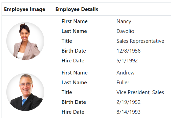
In the following example, Employee Information with Employee Photo is presented in the first column and employee details like Name, Address, etc., are presented in the second column.
<ejs-grid id="Grid" dataSource="@ViewBag.EmployeeDataSource" height="335" width="auto" rowTemplate="#rowtemplate">
    <e-grid-columns>
        <e-grid-column headerText="Employee Image" width="150" textAlign="Center" field= 'OrderID'> </e-grid-column>
        <e-grid-column headerText="Employee Details" width="300" field="EmployeeID" textAlign="Left"></e-grid-column>
    </e-grid-columns>
</ejs-grid>

<script id="rowtemplate" type="text/x-template">
    <tr>
        <td class="photo">
            <img src="https://ej2.syncfusion.com/demos/src/grid/images/${EmployeeID}.png" alt="${EmployeeID}" />
        </td>
        <td class="details">
            <table class="cardtable" cellpadding="3" cellspacing="2">
                <colgroup>
                    <col width="50%">
                    <col width="50%">
                </colgroup>
                <tbody>
                    <tr>
                        <td class="cardheader">First Name </td>
                        <td>${FirstName} </td>
                    </tr>
                    <tr>
                        <td class="cardheader">Last Name</td>
                        <td>${LastName} </td>
                    </tr>
                    <tr>
                        <td class="cardheader">Title
                        </td>

                        <td>${Title}
                        </td>
                    </tr>
                </tbody>
            </table>
        </td>
     </tr>
</script>

<style type="text/css" class="cssStyles">
    .photo img {
        width: 100px;
        height: 100px;
        border-radius: 50px;
        box-shadow: inset 0 0 1px #e0e0e0, inset 0 0 14px rgba(0, 0, 0, 0.2);
    }

    .photo,
    .details {
        border-color: #e0e0e0;
        border-style: solid;
        border-width: 1px 0px 0px 0px;
    }

    .photo {
        text-align: center;
    }

    .details {
        padding-left: 18px;
    }

    .e-bigger .details {
        padding-left: 25px;
    }

    .e-device .details {
        padding-left: 8px;
    }

    .details > table {
        width: 100%;
    }

    .cardheader {
        font-weight: 600;
    }

    td {
        padding: 2px 2px 3px 4px;
    }
</style>
public IActionResult Index()
{
ViewBag.EmployeeDataSource = EmployeeDetails.GetAllRecords();
return View();
}
Row template with formatting
The row template feature in Syncfusion® Grid allows you to customize the layout of rows in the grid. This is useful when you want to display images, buttons, or other custom content within the rows of a grid.
By default, Syncfusion® Grid provides the columns.format property to format the values displayed in each column. However, when using the rowtemplate, the columns.format property cannot be directly applied to format the values inside the template.
To format the values within the row template, you can define a global function that handles the formatting logic. This function can be invoked inside the template to format the corresponding values.
Here is an example of how to define a global formatting function for a date column and use it inside a rowTemplate:
<ejs-grid id="Grid" dataSource="@ViewBag.EmployeeDataSource" height="335" width="auto" rowTemplate="#rowtemplate">
    <e-grid-columns>
        <e-grid-column headerText="Employee Image" width="150" textAlign="Center" field= 'OrderID'> </e-grid-column>
        <e-grid-column headerText="Employee Details" width="300" field="EmployeeID" textAlign="Left"></e-grid-column>
    </e-grid-columns>
</ejs-grid>

<script type="text/javascript">
    var intl = new ej.base.Internationalization();
    var dateFormatter = intl.getDateFormat({ skeleton: 'yMd', type: 'date' });
    window.formatDate = function(date) {
        return dateFormatter(date);
    };
</script>

<script id="rowtemplate" type="text/x-template">
   <tr>
       <td class="photo">
           <img src="https://ej2.syncfusion.com/demos/src/grid/images/${EmployeeID}.png" alt="${EmployeeID}" />
       </td>
       <td class="details">
           <table class="cardtable" cellpadding="3" cellspacing="2">
               <colgroup>
                   <col width="50%">
                   <col width="50%">
               </colgroup>
               <tbody>
                   <tr>
                       <td class="cardheader">First Name </td>
                       <td>${FirstName} </td>
                   </tr>
                   <tr>
                       <td class="cardheader">Last Name</td>
                       <td>${LastName} </td>
                   </tr>
                   <tr>
                       <td class="cardheader">Title
                       </td>

                       <td>${Title}
                       </td>
                   </tr>
                   <tr>
                       <td class="cardheader">Birth Date
                       </td>
                       <td>${formatDate(data.BirthDate)}
                       </td>
                   </tr>
                   <tr>
                       <td class="cardheader">Hire Date
                       </td>
                       <td>${formatDate(data.HireDate)}
                       </td>
                   </tr>
               </tbody>
           </table>
       </td>
    </tr>
</script>

<style type="text/css" class="cssStyles">
   .photo img {
       width: 100px;
       height: 100px;
       border-radius: 50px;
       box-shadow: inset 0 0 1px #e0e0e0, inset 0 0 14px rgba(0, 0, 0, 0.2);
   }

   .photo,
   .details {
       border-color: #e0e0e0;
       border-style: solid;
       border-width: 1px 0px 0px 0px;
   }

   .photo {
       text-align: center;
   }

   .details {
       padding-left: 18px;
   }

   .e-bigger .details {
       padding-left: 25px;
   }

   .e-device .details {
       padding-left: 8px;
   }

   .details > table {
       width: 100%;
   }

   .cardheader {
       font-weight: 600;
   }

   td {
       padding: 2px 2px 3px 4px;
   }
</style>
public IActionResult Index()
{
ViewBag.EmployeeDataSource = EmployeeDetails.GetAllRecords();
return View();
}
When using the
rowTemplatefeature in Syncfusion® Grid, keep in mind that any formatting applied to columns using thecolumns.formatproperty will not work inside the template.
Render syncfusion® control in row template
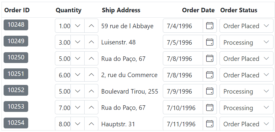
The Grid allows you to render custom Syncfusion® controls within the rows of the grid. This feature is helpful as it enables you to display interactive Syncfusion® controls instead of field values in the grid.
To enable a Syncfusion® control in a row template, you need to set the rowTemplate property of the Grid component. This property accepts a custom HTML template that defines the layout for each row.
Here is an example that demonstrates rendering Syncfusion® controls within a row template:
<ejs-grid id="Grid" dataSource="@ViewBag.DataSource" height="335" width="auto" rowTemplate="#rowtemplate" dataBound="dataBound">
    <e-grid-columns>
        <e-grid-column field="OrderID" headerText="Order ID" width="120"></e-grid-column>
        <e-grid-column field="Quantity" headerText="Quantity" width="170"></e-grid-column>
        <e-grid-column field="ShipAddress" headerText="Ship Address" width="170"></e-grid-column>
        <e-grid-column field="OrderDate" headerText="Order Date" width="120"></e-grid-column>
        <e-grid-column field="OrderStatus" headerText="Order Status" width="120"></e-grid-column>
    </e-grid-columns>
</ejs-grid>

<script id="rowtemplate" type="text/x-template">
    <tr class="rows">
        <td class="chipList">${OrderID}</td>
        <td><input class="numeric" type="text" value=${Quantity}></td>
        <td>${ShipAddress}</td>
        <td><input class="date-input" value="${OrderDate}"></td>
        <td><input class="dropDownList" type="text" value="${OrderStatus}"></td>
    </tr>
</script>

<script>
    function dataBound(){
        var gridInstance = document.getElementById('Grid').ej2_instances[0];

        var chipList = gridInstance.getContentTable().querySelectorAll('.chipList');
        for (var i = 0; i < chipList.length; i++) {
            var chipValue = chipList[i].innerText;
            new ej.buttons.ChipList({ chips: [chipValue] }, chipList[i]);
        }

        var numericList = gridInstance.getContentTable().querySelectorAll('.numeric');
        for (var i = 0; i < numericList.length; i++) {
            var numberValue = new ej.inputs.NumericTextBox({});
            numberValue.appendTo(numericList[i]);
        }

        var dateList = gridInstance.getContentTable().querySelectorAll('.date-input');
        for (var i = 0; i < dateList.length; i++) {
            var dateInput = dateList[i];
            var dateValue = dateInput.value;
            var datePicker = new ej.calendars.DatePicker({
                value: new Date(dateValue),
            });
            datePicker.appendTo(dateInput);
        }

        var dropDownList = gridInstance.getContentTable().querySelectorAll('.dropDownList');
        for (var i = 0; i < dropDownList.length; i++) {
            var dropDownInputValue = dropDownList[i];
            var dropData = ['Processing', 'Order Placed', 'Delivered'];
            var dropDown = new ej.dropdowns.DropDownList({
                dataSource: dropData,
                value: dropDownList[i].value,
                popupHeight: 150,
                popupWidth: 150
            });
            dropDown.appendTo(dropDownInputValue);
        }
    }
</script>
public IActionResult Index()
{
ViewBag.DataSource = OrderDetails.GetAllRecords();
return View();
}
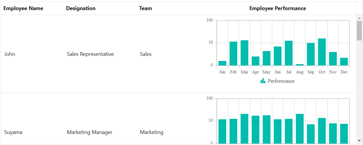
Render Syncfusion® Chart in row template
The Syncfusion® Grid component provides the flexibility to include custom controls, such as Chart, within the rows of the Grid. This feature enhances Grid interactivity by allowing you to display graphical representations of data instead of plain text.
To render a Syncfusion® Chart within a row template of the Grid, you can utilize the rowTemplate property. This property accepts a custom HTML template that specifies the layout for each row, allowing for rich data visualization.
Here is an example that demonstrates rendering Syncfusion Chart within a row template:
@using Newtonsoft.Json
<ejs-grid id="grid" dataSource="@ViewBag.employeeData" height="348px" width="auto" dataBound="dataBound" rowTemplate='#rowtemplate'>
    <e-grid-columns>
        <e-grid-column field="Name" headerText="Employee Name" width="120"></e-grid-column>
        <e-grid-column field="Designation" headerText="Designation" width="140"></e-grid-column>
        <e-grid-column field="Team" headerText="Team" width="120"></e-grid-column>
        <e-grid-column headerText="Employee Performance" textAlign="Center" width="300"></e-grid-column>
    </e-grid-columns>
</ejs-grid>
<script id="rowtemplate" type="text/x-template">
    <tr>
        <td class="custom">
            <div>
            ${Name}
            </div>
        </td>
        <td class="custom">
            <div>
            ${Designation}
            </div>
        </td>
        <td class="custom">
            <div>
           ${Team}
            </div>
        </td>
        <td class="details">
            <div class='chart-container'></div>
        </td>
     </tr>
</script>
<script>
    var employeeData = @Html.Raw(Json.Serialize(ViewBag.employeeData));
    var employeePerformanceData = @Html.Raw(Json.Serialize(ViewBag.employeePerformanceData));
    function dataBound() {
        let gridInstance = document.getElementById('grid').ej2_instances[0];
        let chartList = gridInstance.getContentTable().querySelectorAll('.chart-container');
        for (let i = 0; i < chartList.length; i++) {
            let chartData = getChartData(employeeData[i].employeeID);
            let chartComponent = new ej.charts.Chart({
                height: "200",
                primaryXAxis: { valueType: 'Category' },
                series: [{
                    dataSource: chartData,
                    type: "Column",
                    xName: "month",
                    yName: "performance",
                    name: "Performance"
                }],
            });
            chartComponent.appendTo(chartList[i]);
        }
    }
    function getChartData(employeeID) {
        const employeePerformance = employeePerformanceData.find(emp => emp.employeeID === employeeID);
        return employeePerformance ? employeePerformance.chartData : [];
    }
</script>
<style>
    .custom,
    .details {
        border-color: #e0e0e0;
        border-style: solid;
    }
    .custom {
        border-width: 1px 0px 0px 0px;
    }
    .details {
        border-width: 1px 0px 0px 0px;
    }
    td {
        padding: 5px 8px;
        font-size: 14px;
    }
</style>
public void OnGet()
{
ViewData["employeeData"] = EmployeeDetails.GetAllRecords();
ViewData["employeePerformanceData"] = EmployeePerformanceDetails.GetAllRecords();
}
Limitations
Row template feature is not compatible with all the features which are available in the grid, and it has limited features support. The features that are incompatible with the row template feature are listed below.
- Filtering
- Paging
- Sorting
- Searching
- Rtl
- Export
- Context Menu
- State Persistence
- Selection
- Grouping
- Editing
- Frozen rows & columns
- Virtual & Infinite scrolling
- Column chooser
- Column menu
- Detail Row
- Foreignkey column
- Resizing
- Reordering
- Aggregates
- Clipboard
- Adaptive view