Responsive and adaptive layout
23 Jan 20252 minutes to read
The control is provided with built-in responsive support, where panels within the layout get adjusted based on their parent element’s dimensions to accommodate any resolution which relieves the burden of building responsive dashboards.
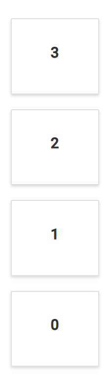
The Dashboard Layout is designed to automatically adapt with lower resolutions by transforming the entire layout into a stacked one, so that the panels will be displayed in a vertical column. By default, whenever the screen resolution meets 600px or lower resolutions this layout transformation occurs. This transformation can be modified for any user defined resolution by defining the mediaQuery property of the control.
The following sample demonstrates the usage of the mediaQuery property to turn out the layout into a stacked one in user defined resolution. Here, whenever the window size reaches 700px or lesser, the layout becomes a stacked layout.
@{
    ....
    adaptiveSpacingModel modelValue = new adaptiveSpacingModel();
    modelValue.cellSpacing = new double[] { 20, 20 };
}
<div>
    <!--  Dashboardlayout element declaration -->
    <ejs-dashboardlayout id="dashboard_layout" columns="5" mediaQuery="max-width: 700px" cellSpacing="@modelValue.cellSpacing">
        <e-dashboardlayout-panels>
            <e-dashboardlayout-panel sizeX="1" sizeY="1" row="0" col="0" content="<div>0</div>">
            </e-dashboardlayout-panel>
            <e-dashboardlayout-panel sizeX="3" sizeY="2" row="0" col="1" content="<div>1</div>">
            </e-dashboardlayout-panel>
            <e-dashboardlayout-panel sizeX="1" sizeY="3" row="0" col="4" content="<div>2</div>">
            </e-dashboardlayout-panel>
            <e-dashboardlayout-panel sizeX="1" sizeY="1" row="1" col="0" content="<div>3</div>">
            </e-dashboardlayout-panel>
        </e-dashboardlayout-panels>
    </ejs-dashboardlayout>
</div>
<!-- end of dashboardlayout element -->

<style>
    /* DashboardLayout element styles  */
    #dashboard_layout .e-panel .e-panel-container {
        vertical-align: middle;
        font-weight: 600;
        font-size: 20px;
        text-align: center;
        line-height: 90px;
    }
</style>
public class adaptiveSpacingModel
{
public double[]? cellSpacing { get; set; }
}
NOTE
You can refer to our ASP.NET Core Dashboard Layout feature tour page for its groundbreaking feature representations. You can also explore our ASP.NET Core Dashboard Layout example to know how to present and manipulate data.