Editor Menus in ASP.NET Core Block Editor control
18 Jun 202624 minutes to read
The Block Editor control provides several interactive menus to enhance content creation and editing. These menus offer quick access to various commands and formatting options.
Slash command menu
The Slash Command menu allows users to quickly insert or transform blocks by typing / followed by a command. This provides an efficient, keyboard-driven way to interact with the editor.
Built-in items
The Slash Command menu comes with a set of pre-defined commands for all block types:
- Headings(Level 1 to 4): to insert respective heading blocks.
- Lists(Bullet, Numbered, Checklist): for different list types.
- Paragraph: for standard text blocks.
- Image: for media insertion.
- Table: Inserts a table block.
- Toggle: for collapsible content.
- Callout: for highlighting important information.
- Utility(Divider, Quote, Code): for other utility blocks.
Customize Slash command menu
You can utilize the e-blockeditor-commandmenusettings tag helper on the Block Editor control to customize the Slash Command menu to include your own custom commands and other modifications.
Show or hide tooltip
By default, the tooltip is displayed when the user hovers over the command item. You can show or hide the tooltip using the enableTooltip property on the e-blockeditor-commandmenusettings tag helper.
Events
The following events are available in the Slash Command menu.
| Name | Args | Description |
|---|---|---|
filtering |
CommandFilteringEventArgs | Triggers when the user types to filter the command menu items. |
itemSelect |
CommandItemSelectEventArgs | Triggers when the user clicks on a command menu item. |
Below example demonstrates the customization of the Slash Command menu.
@using Syncfusion.EJ2.BlockEditor
<div id='blockeditor-container'>
<ejs-blockeditor id="block-editor" blocks="@ViewBag.BlocksData">
<e-blockeditor-commandmenusettings enableTooltip="false" popupWidth="350px" popupHeight="400px" commands="@ViewBag.CommandMenuItems" itemSelect="function(e){ itemSelect(e); }" filtering="function(e){ filtering(e); }"></e-blockeditor-commandmenusettings>
</ejs-blockeditor>
<div id="controls">
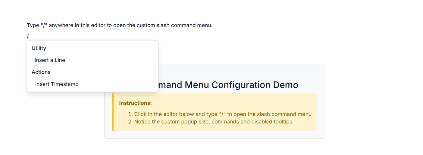
<h3>Slash Command Menu Configuration Demo</h3>
<div class="instructions">
<p><strong>Instructions:</strong></p>
<ol>
<li>
Click in the editor below and type "/" to open the slash command
menu
</li>
<li>Notice the custom popup size, commands and disabled tooltips</li>
</ol>
</div>
</div>
</div>
<style>
#blockeditor-container {
margin: 20px auto;
gap: 20px;
display: flex;
flex-direction: column;
align-items: center;
}
#controls {
margin-bottom: 20px;
padding: 20px;
border: 1px solid #ddd;
border-radius: 5px;
background-color: #f8f9fa;
}
.instructions {
padding: 15px;
background-color: #fff3cd;
border-left: 4px solid #ffc107;
border-radius: 4px;
}
.instructions p {
margin-top: 0;
color: #856404;
font-weight: bold;
}
.instructions ol {
margin-bottom: 0;
color: #856404;
}
#output {
margin-top: 15px;
padding: 10px;
background-color: #f8f9fa;
border-radius: 4px;
min-height: 100px;
font-family: monospace;
white-space: pre-wrap;
max-height: 300px;
overflow-y: auto;
border: 1px solid #dee2e6;
}
</style>
<script>
function filtering(args) {
// Your actions here
}
function itemSelect(args) {
// Handle custom block actions
}
</script>using Syncfusion.EJ2.BlockEditor;
public List<BlockModel> BlocksData { get; set; }
public List<object> CommandMenuItems { get; set; }
public CommandMenuSettings CommandMenuSettings { get; set; }
public class BlockModel
{
public string id { get; set; }
public string blockType { get; set; }
public object properties { get; set; }
public List<object> content { get; set; }
}
public ActionResult SlashCommand()
{
CommandMenuItems = new List<object>
{
new
{
id = "line-cmd",
type = "Divider",
groupHeader = "Utility",
label = "Insert a Line",
iconCss = "e-icons e-divider",
},
new
{
id = "timestamp-cmd",
groupHeader = "Actions",
label = "Insert Timestamp",
iconCss = "e-icons e-schedule",
}
};
BlocksData = new List<BlockModel>
{
new BlockModel
{
id = "Paragraph",
blockType = "Paragraph",
content = new List<object>
{
new { contentType = "Text", content = "Type \"/\" anywhere in this editor to open the custom slash command menu." }
}
}
};
CommandMenuSettings = new CommandMenuSettings()
{
PopupWidth = "350px",
PopupHeight = "400px",
ItemSelect = "itemSelect",
Filtering = "filtering",
Commands = CommandMenuItems
};
ViewData["CommandMenuItems"] = CommandMenuItems;
ViewData["CommandMenuSettings"] = CommandMenuSettings;
ViewData["BlocksData"] = BlocksData;
return View();
}
Context menu
The Context menu appears when a user right-clicks within a specific block. It provides context-aware actions relevant to the clicked block or content.
Built-in items
The Context menu offers different built-in options:
- Undo/Redo: Undo and redo actions.
- Cut/Copy/Paste: Standard clipboard actions.
- Indent: Increase or decrease the indent level of the selected block.
-
Link: Allows you to add or edit a hyperlink for the selected text. When a link is present, the context menu provides options such as
Open Link,Edit Link,Copy Link, andRemove Link. -
Table: Provides built-in table actions such as
InsertandDelete. These options appear in the context menu when the cursor is focused within a table cell and the context menu is opened.
Customize Context menu
You can utilize the e-blockeditor-contextmenusettings tag helper on the Block Editor to customize the Context menu to add specific actions or modify existing ones based on the application needs.
Events
The following events are available in the Context menu.
| Name | Args | Description |
|---|---|---|
opening |
ContextMenuOpeningEventArgs | Triggers before the context menu opens. |
closing |
ContextMenuClosingEventArgs | Triggers before the context menu closes. |
itemSelect |
ContextMenuItemSelectEventArgs | Triggers when a context menu item is clicked. |
Below example demonstrates the customization of the Context menu.
@using Syncfusion.EJ2.BlockEditor
<div id='blockeditor-container'>
<ejs-blockeditor id="block-editor" blocks="@ViewBag.BlocksData">
<e-blockeditor-contextmenusettings enable="true" items="@ViewBag.ContextMenuItems" showItemOnClick="true" itemClick="function(e){ itemClick(e); }"></e-blockeditor-contextmenusettings>
</ejs-blockeditor>
<div id="controls">
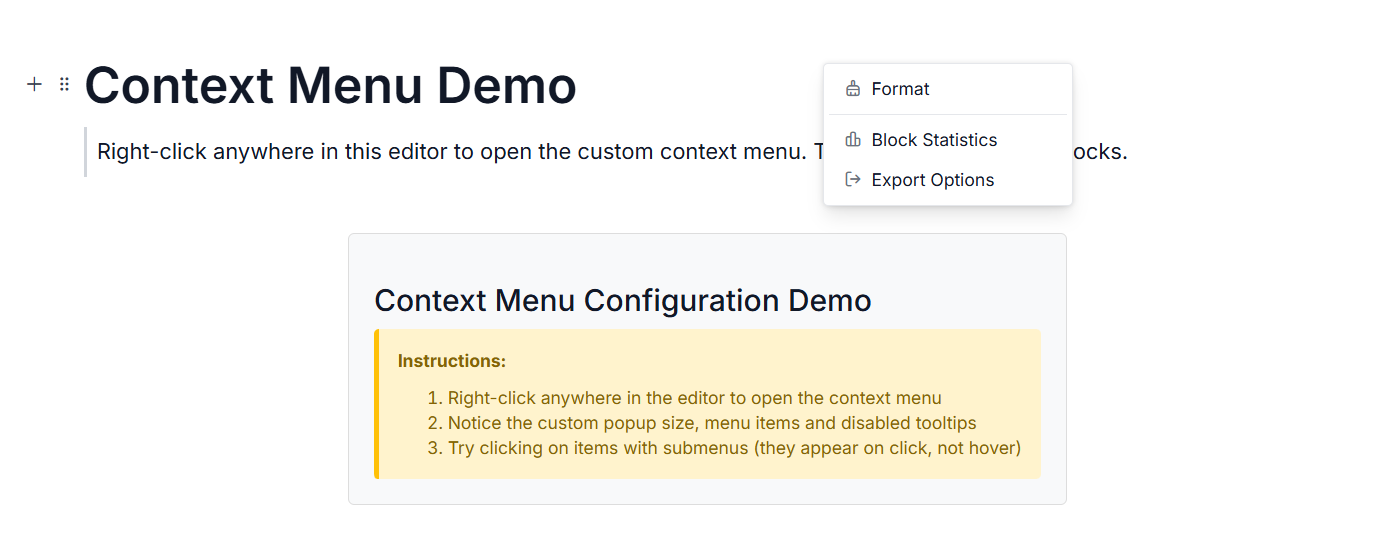
<h3>Context Menu Configuration Demo</h3>
<div class="instructions">
<p><strong>Instructions:</strong></p>
<ol>
<li>Right-click anywhere in the editor to open the context menu</li>
<li>Notice the custom popup size, menu items and disabled tooltips</li>
<li>Try clicking on items with submenus (they appear on click, not hover)</li>
</ol>
</div>
</div>
</div>
<style>
#blockeditor-container {
margin: 20px auto;
gap: 20px;
display: flex;
flex-direction: column;
align-items: center;
}
#controls {
margin-bottom: 20px;
padding: 20px;
border: 1px solid #ddd;
border-radius: 5px;
background-color: #f8f9fa;
}
.instructions {
padding: 15px;
background-color: #fff3cd;
border-left: 4px solid #ffc107;
border-radius: 4px;
}
.instructions p {
margin-top: 0;
color: #856404;
font-weight: bold;
}
.instructions ol {
margin-bottom: 0;
color: #856404;
}
#output {
margin-top: 15px;
padding: 10px;
background-color: #f8f9fa;
border-radius: 4px;
min-height: 100px;
font-family: monospace;
white-space: pre-wrap;
max-height: 300px;
overflow-y: auto;
border: 1px solid #dee2e6;
}
</style>
<script>
function open(args) {
// Your actions here
}
function close(args) {
// Your actions here
}
function itemClick(args) {
// Handle custom block actions
}
</script>using Syncfusion.EJ2.BlockEditor;
public List<BlockModel> BlocksData { get; set; }
public List<object> ContextMenuItems { get; set; }
public ContextMenuSettings ContextMenuSettings { get; set; }
public class BlockModel
{
public string id { get; set; }
public string blockType { get; set; }
public object properties { get; set; }
public List<object> content { get; set; }
}
public ActionResult ContextMenu()
{
var Items1 = new List<object>(){
new {
id = "bold-item",
text = "Bold",
iconCss = "e-icons e-bold",
},
new {
id = "italic-item",
text = "Italic",
iconCss = "e-icons e-italic",
},
new {
id = "underline-item",
text = "Underline",
iconCss = "e-icons e-underline",
}
};
var Items2 = new List<object>(){
new {
id = "export-json",
text = "Export as JSON",
iconCss = "e-icons e-file-json",
},
new {
id = "export-html",
text = "Export as HTML",
iconCss = "e-icons e-file-html",
},
new {
id = "export-pdf",
text = "Export as PDF",
iconCss = "e-icons e-file-pdf",
}
};
ContextMenuItems = new List<object>
{
new {
id = "format-menu",
text = "Format",
iconCss = "e-icons e-format-painter",
items = Items1
},
new { separator = true },
new {
id = "statistics-item",
text = "Block Statistics",
iconCss = "e-icons e-chart"
},
new {
id = "export-item",
text = "Export Options",
iconCss = "e-icons e-export",
items = Items2
}
};
BlocksData = new List<BlockModel>
{
new BlockModel
{
id = "title-block",
blockType = "Heading",
properties = new { level = 1},
content = new List<object>
{
new { contentType = "Text", content = "Context Menu" }
}
},
new BlockModel
{
id = "paragraph-block",
blockType = "Paragraph",
content = new List<object>
{
new { contentType = "Text", content = "This is a sample text with a " },
new {
contentType = "Link",
content = "link",
url = "https://ej2.syncfusion.com/documentation/block-editor/getting-started",
title = "Block Editor Documentation"
},
new { contentType = "Text", content = ". Right-click the link to see link context menu options." }
}
},
new BlockModel
{
id = "link-quote-block",
blockType = "Quote",
properties = new {
children = new List<object>
{
new {
id = "link-quote-paragraph",
blockType = "Paragraph",
content = new List<object>
{
new {
contentType = "Text",
content = "When the cursor is focused on a link, right-click to open the context menu with options like Open Link, Edit Link, Copy Link, and Remove Link."
}
}
}
}
}
},
new BlockModel
{
id = "table-block",
blockType = "Table",
properties = new {
columns = new List<object>
{
new { id = "col1", headerText = "Column 1" },
new { id = "col2", headerText = "Column 2" }
},
rows = new List<object>
{
new {
cells = new List<object>
{
new {
columnId = "col1",
blocks = new List<object>
{
new {
id = "cell1-paragraph",
blockType = "Paragraph",
content = new List<object>
{
new { contentType = "Text", content = "Cell 1" }
}
}
}
},
new {
columnId = "col2",
blocks = new List<object>
{
new {
id = "cell2-paragraph",
blockType = "Paragraph",
content = new List<object>
{
new { contentType = "Text", content = "Cell 2" }
}
}
}
}
}
},
new {
cells = new List<object>
{
new {
columnId = "col1",
blocks = new List<object>
{
new {
id = "cell3-paragraph",
blockType = "Paragraph",
content = new List<object>
{
new { contentType = "Text", content = "Cell 3" }
}
}
}
},
new {
columnId = "col2",
blocks = new List<object>
{
new {
id = "cell4-paragraph",
blockType = "Paragraph",
content = new List<object>
{
new { contentType = "Text", content = "Cell 4" }
}
}
}
}
}
}
}
}
},
new BlockModel
{
id = "table-quote-block",
blockType = "Quote",
properties = new {
children = new List<object>
{
new {
id = "table-quote-paragraph",
blockType = "Paragraph",
content = new List<object>
{
new {
contentType = "Text",
content = "Right-click inside a table cell to open the context menu, where you can access options such as inserting or deleting rows/columns and formatting the table."
}
}
}
}
}
}
};
ContextMenuSettings = new ContextMenuSettings()
{
Enable = true,
ShowItemOnClick = true,
Opening = "open",
Closing = "close",
ItemSelect = "itemClick",
Items = ContextMenuItems
};
ViewData["ContextMenuItems"] = ContextMenuItems;
ViewData["ContextMenuSettings"] = ContextMenuSettings;
ViewData["BlocksData"] = BlocksData;
return View();
}
Block action menu
The Block Action menu typically appears next to a block when you hover over it and click on the drag handle icon, offering quick actions specific to that block.
Built-in items
The Block Action menu provides convenient actions for managing individual blocks:
- Duplicate: Create a copy of the current block.
- Delete: Remove the block from the editor.
- Move Up: Move the block one level up in the hierarchy.
- Move Down: Move the block one level down in the hierarchy.
Customize Block action menu
You can utilize the e-blockeditor-blockactionmenusettings tag helper on the block editor to customize the Block action menu to include block-specific commands relevant to your application. This allows for highly tailored user experiences.
Show or hide tooltip
By default, the tooltip is displayed when the user hovers over the action item. You can show or hide the tooltip using the enableTooltip property on the block action menu settings.
Events
The following events are available in the Block action menu.
| Name | Args | Description |
|---|---|---|
opening |
BlockActionMenuOpeningEventArgs | Triggers when the block action menu is opened. |
closing |
BlockActionMenuClosingEventArgs | Triggers when the block action menu is closed. |
itemSelect |
BlockActionItemSelectEventArgs | Triggers when a block action menu item is clicked. |
Below example demonstrates the customization of the Block action menu.
@using Syncfusion.EJ2.BlockEditor
<div id='blockeditor-container'>
<ejs-blockeditor id="block-editor" blocks="@ViewBag.BlocksData">
<e-blockeditor-blockactionmenusettings items="@ViewBag.BlockItems" enable="true" popupWidth="180px" popupHeight="110px" enableTooltip="false" open="function(e){ open(e); }" close="function(e){ close(e); }" itemClick="function(e){ itemClick(e); }"></e-blockeditor-blockactionmenusettings>
</ejs-blockeditor>
<div id="controls">
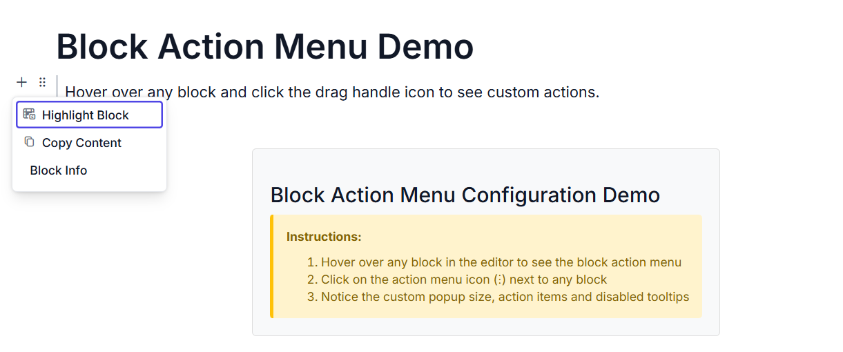
<h3>Block Action Menu Configuration Demo</h3>
<div class="instructions">
<p><strong>Instructions:</strong></p>
<ol>
<li>
Hover over any block in the editor to see the block action menu
</li>
<li>Click on the action menu icon (⋮) next to any block</li>
<li>Notice the custom popup size, action items and disabled tooltips</li>
</ol>
</div>
</div>
</div>
<style>
#blockeditor-container {
margin: 20px auto;
gap: 20px;
display: flex;
flex-direction: column;
align-items: center;
}
#controls {
margin-bottom: 20px;
padding: 20px;
border: 1px solid #ddd;
border-radius: 5px;
background-color: #f8f9fa;
}
.instructions {
padding: 15px;
background-color: #fff3cd;
border-left: 4px solid #ffc107;
border-radius: 4px;
}
.instructions p {
margin-top: 0;
color: #856404;
font-weight: bold;
}
.instructions ol {
margin-bottom: 0;
color: #856404;
}
#output {
margin-top: 15px;
padding: 10px;
background-color: #f8f9fa;
border-radius: 4px;
min-height: 100px;
font-family: monospace;
white-space: pre-wrap;
max-height: 300px;
overflow-y: auto;
border: 1px solid #dee2e6;
}
</style>
<script>
function open(args) {
// Your actions here
}
function close(args) {
// Your actions here
}
function itemClick(args) {
// Handle custom block actions
}
</script>using Syncfusion.EJ2.BlockEditor;
public List<BlockModel> BlocksData { get; set; } = new List<BlockModel>();
public List<object> BlockItems { get; set; }
public BlockActionMenuSettings BlockActionMenuSettings { get; set; }
public class BlockModel
{
public string id { get; set; }
public string blockType { get; set; }
public object properties { get; set; }
public List<object> content { get; set; }
}
public ActionResult BlockAction()
{
BlocksData.Add(new BlockModel() {
blockType = "Heading",
properties = new { level = 1},
content = new List<object>()
{
new {
contentType = "Text",
content = "Block Action Menu Demo"
}
}
});
BlocksData.Add(new BlockModel()
{
blockType = "Quote",
content = new List<object>()
{
new {
contentType = "Text",
content = "Hover over any block and click the drag handle icon to see custom actions."
}
}
});
BlockItems = new List<object>()
{
new
{
id = "highlight-action",
label = "Highlight Block",
iconCss = "e-icons e-highlight",
tooltip = "Highlight this block"
},
new
{
id = "copy-content-action",
label = "Copy Content",
iconCss = "e-icons e-copy",
tooltip = "Copy block content to clipboard"
},
new
{
id = "block-info-action",
label = "Block Info",
tooltip = "Show block information"
}
};
BlockActionMenuSettings = new BlockActionMenuSettings()
{
Enable = true,
EnableTooltip = false,
PopupHeight = "110px",
PopupWidth = "180px",
Opening = "open",
Closing = "close",
ItemSelect= "itemClick",
Items = BlockItems
};
ViewBag.BlockItems = BlockItems;
ViewBag.BlocksData = BlocksData;
return View();
}
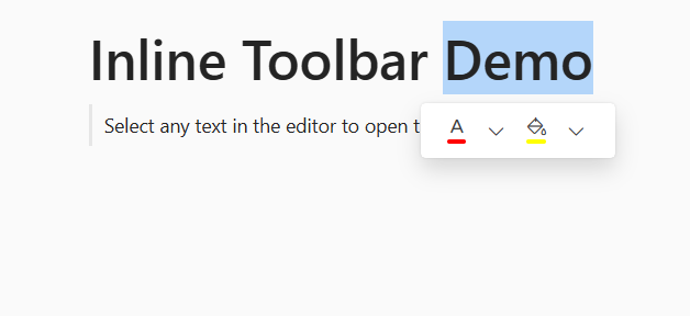
Inline Toolbar
The Inline Toolbar appears when a text is selected in the editor, providing quick access to common text formatting actions that apply to the inline content.
Built-in items
The Inline Toolbar includes below built-in formatting options:
- Text Styles: Bold, Italic, Underline, Strikethrough.
- Superscript/Subscript: For mathematical or scientific notations.
- Case Conversion: Uppercase, Lowercase.
- Text Color: Change text color.
- Background Color: Change background color.
Optional items
The inline toolbar can handle custom items like Transform, InlineCode, Link by passing array of string values in Items property in inlineToolbarSettings.
Transform block options
The inline toolbar now includes Transform options to quickly convert blocks between different types. You can use the [transformSettings] property to handle customization of the transform menu in the inline toolbar. This allows you to configure available block transformations, define custom menu items with text and icons, and control their behavior.
Built-in default transform block options
Below are the built-in transform block options available:
| Built-in transform Block Types |
|---|
| Paragraph |
| Heading1 to Heading4 |
| Checklist |
| BulletList |
| NumberedList |
For blocks such as
Code,Callout,Quote,Divider,Image,TableandCollapsibletransform options not available. Instead they will be added as a new block.
Events
The following events are available for the transform toolbar item menu:
| Name | Args | Description |
|---|---|---|
itemSelect |
TransformItemSelectEventArgs | Triggers when a command item is clicked. |
Inline code support
Added inline code formatting in the toolbar, with light syntax highlighting and seamless integration with other text formatting options.
Inline link support
Added inline link formatting in the toolbar, by link item click, link dialog opens and with proper value updation, link can be inserted on text.
The following example demonstrates how to customize the transform, inline code, link items.
@using Syncfusion.EJ2.BlockEditor

<div id='blockeditor-container'>
    <ejs-blockeditor transformSettings="@ViewBag.Transform" height="300px" blocks="@ViewBag.BlockData" id="block-editor">
        <e-blockeditor-inlinetoolbarsettings enable=true popupWidth="180px" items="@ViewBag.InlineToolbarItems"></e-blockeditor-inlinetoolbarsettings>
    </ejs-blockeditor>
</div>

<style>
    #blockeditor-container {
        margin: 20px auto;
    }
</style>
using Syncfusion.EJ2.BlockEditor;
public List<BlockModel> BlockData { get; set; }
public string[] InlineToolbarItems { get; set; }
public InlineToolbarSettings InlineToolbarSettings { get; set; }
public TransformSettings Transform { get; set; }
public string[] TransformItems { get; set; }
public class BlockModel
{
public string id { get; set; }
public string blockType { get; set; }
public object properties { get; set; }
public List<object> content { get; set; }
public List<BlockModel> children { get; set; }
}
public class TransformSettings
{
public string[] Items { get; set; }
}
public ActionResult Transform()
{
InlineToolbarItems = new string[] { "Transform", "Bold", "InlineCode", "Link" };
TransformItems = new string[] { "Paragraph", "Heading1" };
BlockData = new List<BlockModel>
{
new BlockModel
{
id = "title-block",
blockType = "Heading",
properties = new { level = 1},
content = new List<object>
{
new { contentType = "Text", content = "Inline Toolbar Demo" }
}
},
new BlockModel
{
id = "intro-block",
blockType = "Quote",
properties = new {
children = new List<BlockModel>()
{
new BlockModel()
{
id = "callout-content-1",
blockType = "Paragraph",
content = new List<object>
{
new
{
contentType = "Text",
content = "Select any text in the editor to open the Inline Toolbar"
}
}
}
}
}
}
};
InlineToolbarSettings = new InlineToolbarSettings()
{
Enable = true,
PopupWidth = "180px",
Items = InlineToolbarItems
};
Transform = new TransformSettings()
{
Items = TransformItems
};
ViewData["InlineToolbarItems"] = InlineToolbarItems;
ViewData["InlineToolbarSettings"] = InlineToolbarSettings;
ViewData["TransformSettings"] = Transform;
ViewData["BlockData"] = BlockData;
return View();
}
Font and background color support
Enhanced font and background color options in the inline toolbar with integrated ColorPicker. You can use the fontColorSettings, backgroundColorSettings properties to handle for text customization, highlighting, predefined palettes, custom inputs, and quick previews.
The following example demonstrates how to customize the font and background color toolbar items.
@using Syncfusion.EJ2.BlockEditor

<div id='blockeditor-container'>
    @Html.EJS().BlockEditor("block-editor").Height("300px").Blocks(ViewData["BlockData"]).InlineToolbarSettings((InlineToolbarSettings)ViewData["InlineToolbarSettings"]).FontColorSettings((FontColorSettings)ViewData["FontColorSettings"]).BackgroundColorSettings((BackgroundColorSettings)ViewData["BackgroundColorSettings"]).Render()
</div>

<style>
    #blockeditor-container {
        margin: 20px auto;
    }
</style>
using Syncfusion.EJ2.BlockEditor;
public List<BlockModel> BlockData { get; set; }
public string[] InlineToolbarItems { get; set; }
public InlineToolbarSettings InlineToolbarSettings { get; set; }
public FontColorSettings FontColorSettings { get; set; }
public BackgroundColorSettings BackgroundColorSettings { get; set; }
public class BlockModel
{
public string id { get; set; }
public string blockType { get; set; }
public object properties { get; set; }
public List<object> content { get; set; }
public List<BlockModel> children { get; set; }
}
public ActionResult Index()
{
InlineToolbarItems = new string[] { "Color", "Backgroundcolor" };
BlockData = new List<BlockModel>
{
new BlockModel
{
id = "title-block",
blockType = "Heading",
properties = new { level = 1},
content = new List<object>
{
new { contentType = "Text", content = "Inline Toolbar Demo" }
}
},
new BlockModel
{
id = "intro-block",
blockType = "Quote",
properties = new {
children = new List<BlockModel>()
{
new BlockModel()
{
id = "callout-content-1",
blockType = "Paragraph",
content = new List<object>
{
new
{
contentType = "Text",
content = "Select any text in the editor to open the Inline Toolbar"
}
}
}
}
}
}
};
InlineToolbarSettings = new InlineToolbarSettings()
{
Enable = true,
PopupWidth = "140px",
Items = InlineToolbarItems
};
FontColorSettings = new FontColorSettings()
{
Mode = ColorModeType.Picker,
ModeSwitcher = true
};
BackgroundColorSettings = new BackgroundColorSettings()
{
// Handle props here
};
ViewData["InlineToolbarItems"] = InlineToolbarItems;
ViewData["InlineToolbarSettings"] = InlineToolbarSettings;
ViewData["FontColorSettings"] = FontColorSettings;
ViewData["BackgroundColorSettings"] = BackgroundColorSettings;
ViewData["BlockData"] = BlockData;
return View();
}
Customize Inline Toolbar
You can utilize the e-blockeditor-inlinetoolbarsettings tag helper on the Block Editor to customize the Inline Toolbar to add or remove formatting options based on your application’s needs.
Show or hide tooltip
By default, the tooltip is displayed when the user hovers over the toolbar item. You can show or hide the tooltip using the enableTooltip property on the inline toolbar settings.
Events
The following events are available in the Inline Toolbar.
| Name | Args | Description |
|---|---|---|
itemClick |
ToolbarItemClickEventArgs | Triggers when the user clicks on an inline toolbar item. |
Below example demonstrates the customization of the Inline Toolbar.
@using Syncfusion.EJ2.BlockEditor
<div id='blockeditor-container'>
<ejs-blockeditor id="block-editor" blocks="@ViewBag.BlocksData">
<e-blockeditor-inlinetoolbarsettings enable="true" enableTooltip="true" width="80px" items="@ViewBag.InlineToolbarItems" open="function(e){ open(e); }" close="function(e){ close(e); }" itemClicked="function(e){ itemClicked(e); }"></e-blockeditor-inlinetoolbarsettings>
</ejs-blockeditor>
<div id="controls">
<h3>Inline Toolbar Configuration Demo</h3>
<div class="instructions">
<p><strong>Instructions:</strong></p>
<ol>
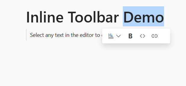
<li>Select any text in the editor to open the Inline Toolbar</li>
<li>Notice the custom popup size, toolbar items and enabled tooltips</li>
</ol>
</div>
</div>
</div>
<style>
#blockeditor-container {
margin: 20px auto;
gap: 20px;
display: flex;
flex-direction: column;
align-items: center;
}
#controls {
margin-bottom: 20px;
padding: 20px;
border: 1px solid #ddd;
border-radius: 5px;
background-color: #f8f9fa;
}
.instructions {
padding: 15px;
background-color: #fff3cd;
border-left: 4px solid #ffc107;
border-radius: 4px;
}
.instructions p {
margin-top: 0;
color: #856404;
font-weight: bold;
}
.instructions ol {
margin-bottom: 0;
color: #856404;
}
#output {
margin-top: 15px;
padding: 10px;
background-color: #f8f9fa;
border-radius: 4px;
min-height: 100px;
font-family: monospace;
white-space: pre-wrap;
max-height: 300px;
overflow-y: auto;
border: 1px solid #dee2e6;
}
</style>
<script>
function open(args) {
// Your actions here
}
function close(args) {
// Your actions here
}
function itemClicked(args) {
// Handle custom block actions
}
</script>using Syncfusion.EJ2.BlockEditor;
public List<BlockModel> BlocksData { get; set; }
public List<object> InlineToolbarItems { get; set; }
public InlineToolbarSettings InlineToolbarSettings { get; set; }
public class BlockModel
{
public string id { get; set; }
public string blockType { get; set; }
public object properties { get; set; }
public List<object> content { get; set; }
}
public ActionResult InlineToolbar()
{
InlineToolbarItems = new List<object>
{
new {
id = "clear",
iconCss = "e-icons e-format-painter",
item = "Custom",
tooltip = "Format Painter"
},
new {
id = "highlight",
iconCss = "e-icons e-highlight",
item = "Custom",
tooltip = "Highlight"
}
};
BlocksData = new List<BlockModel>
{
new BlockModel
{
id = "title-block",
blockType = "Heading",
properties = new { level = 1},
content = new List<object>
{
new { contentType = "Text", content = "Inline Toolbar Demo" }
}
},
new BlockModel
{
id = "intro-block",
blockType = "Quote",
content = new List<object>
{
new
{
contentType = "Text",
content = "Select any text in the editor to open the Inline Toolbar"
}
}
}
};
InlineToolbarSettings = new InlineToolbarSettings()
{
Enable = true,
PopupWidth = "80px",
ItemClick = "itemClicked",
Items = InlineToolbarItems
};
ViewData["InlineToolbarItems"] = InlineToolbarItems;
ViewData["InlineToolbarSettings"] = InlineToolbarSettings;
ViewData["BlocksData"] = BlocksData;
return View();
}