Integrate Avatar into Badge
21 Jan 202513 minutes to read
The Badge is a dependent and supportive control that can be used with Avatar to create a notification Avatar. The default Avatar (.e-avatar) and circle Avatar (.e-avatar-circle) have been used with notification badges (.e-badge-notification) in the following sample.
<div class="sample_container avatar-badge">
    <div class="avatar-block">
        <!-- Card Component -->
        <div class="e-card e-avatar-showcase">
            <div class="e-card-content">
                <div class="avatar-sub-block">
                    <!-- xSmall Avatar-->
                    <div class="e-avatar e-avatar-xsmall">
                        <img src="https://ej2.syncfusion.com/aspnetcore/css/avatar/images/pic01.png" alt="profile_pic">
                    </div>
                    <!-- Notification Badge -->
                    <span class="e-badge e-badge-primary e-badge-overlap e-badge-notification e-badge-circle">6</span>
                </div>
                <div class="avatar-sub-block">
                    <!-- Small Avatar-->
                    <div class="e-avatar e-avatar-small">
                        <img src="https://ej2.syncfusion.com/aspnetcore/css/avatar/images/pic01.png" alt="profile_pic">
                    </div>
                    <!-- Notification Badge -->
                    <span class="e-badge e-badge-primary e-badge-overlap e-badge-notification e-badge-circle">12</span>
                </div>
                <div class="avatar-sub-block">
                    <!-- Avatar-->
                    <div class="e-avatar">
                        <img src="https://ej2.syncfusion.com/aspnetcore/css/avatar/images/pic01.png" alt="profile_pic">
                    </div>
                    <!-- Notification Badge -->
                    <span class="e-badge e-badge-primary e-badge-overlap e-badge-notification">46</span>
                </div>
                <div class="avatar-sub-block">
                    <!-- Large Avatar-->
                    <div class="e-avatar e-avatar-large">
                        <img src="https://ej2.syncfusion.com/aspnetcore/css/avatar/images/pic01.png" alt="profile_pic">
                    </div>
                    <!-- Notification Badge -->
                    <span class="e-badge e-badge-primary e-badge-overlap e-badge-notification">82</span>
                </div>
                <div class="avatar-sub-block">
                    <!-- xLarge Avatar-->
                    <div class="e-avatar e-avatar-xlarge">
                        <img src="https://ej2.syncfusion.com/aspnetcore/css/avatar/images/pic01.png" alt="profile_pic">
                    </div>
                    <!-- Notification Badge -->
                    <span class="e-badge e-badge-primary e-badge-overlap e-badge-notification">99+</span>
                </div>
            </div>
        </div>
    </div>

    <div class="circleAvatar avatar-block">
        <!-- Card Component -->
        <div class="e-card e-avatar-showcase">
            <div class="e-card-content">
                <div class="avatar-sub-block">
                    <!-- xSmall Circle Avatar-->
                    <div class="e-avatar e-avatar-circle e-avatar-xsmall">
                        <img src="https://ej2.syncfusion.com/aspnetcore/css/avatar/images/pic01.png" alt="profile_pic">
                    </div>
                    <!-- Notification Badge -->
                    <span class="e-badge e-badge-primary e-badge-overlap e-badge-notification e-badge-circle">6</span>
                </div>
                <div class="avatar-sub-block">
                    <!-- Small Circle Avatar-->
                    <div class="e-avatar e-avatar-circle e-avatar-small">
                        <img src="https://ej2.syncfusion.com/aspnetcore/css/avatar/images/pic01.png" alt="profile_pic">
                    </div>
                    <!-- Notification Badge -->
                    <span class="e-badge e-badge-primary e-badge-overlap e-badge-notification e-badge-circle">12</span>
                </div>
                <div class="avatar-sub-block">
                    <!-- Circle Avatar-->
                    <div class="e-avatar e-avatar-circle">
                        <img src="https://ej2.syncfusion.com/aspnetcore/css/avatar/images/pic01.png" alt="profile_pic">
                    </div>
                    <!-- Notification Badge -->
                    <span class="e-badge e-badge-primary e-badge-overlap e-badge-notification">46</span>
                </div>
                <div class="avatar-sub-block">
                    <!-- Large Circle Avatar-->
                    <div class="e-avatar e-avatar-circle e-avatar-large">
                        <img src="https://ej2.syncfusion.com/aspnetcore/css/avatar/images/pic01.png" alt="profile_pic">
                    </div>
                    <!-- Notification Badge -->
                    <span class="e-badge e-badge-primary e-badge-overlap e-badge-notification">82</span>
                </div>
                <div class="avatar-sub-block">
                    <!-- xLarge Circle Avatar-->
                    <div class="e-avatar e-avatar-circle e-avatar-xlarge">
                        <img src="https://ej2.syncfusion.com/aspnetcore/css/avatar/images/pic01.png" alt="profile_pic">
                    </div>
                    <!-- Notification Badge -->
                    <span class="e-badge e-badge-primary e-badge-overlap e-badge-notification">99+</span>
                </div>
            </div>
        </div>
    </div>
</div>

<style>
    .sample_container.avatar-badge .avatar-sub-block {
        display: inline-block;
        position: relative;
        margin: 7px
    }

    .sample_container.avatar-badge .avatar-block {
        display: inline-block;
        vertical-align: top;
    }

    /* Media Queries for various devices */

    @@media only screen and (max-width: 965px) {
        .sample_container.avatar-badge {
            max-width: 332px;
            margin: auto;
            margin-top: 0;
        }

        .circleAvatar {
            margin-top: 15px;
        }

        .e-avatar-showcase.e-card {
            width: 320px;
        }
    }

    @@media only screen and (min-width: 965px) {
        .sample_container.avatar-badge {
            max-width: 825px;
            margin: auto;
            margin-top: 70px;
        }

        .e-avatar-showcase.e-card {
            width: 400px;
        }
    }

    .e-avatar.image {
        background-repeat: no-repeat;
        background-size: cover;
        background-position: center;
    }

    /* Card Customization */

    .e-avatar-showcase.e-card {
        height: 140px;
        padding: 4px;
        margin: 5px;
        box-shadow: 0 1px 3px rgba(0, 0, 0, 0.12), 0 1px 2px rgba(0, 0, 0, 0.24);
        border-radius: 8px;
    }

    .e-avatar-showcase.e-card .e-card-header .e-card-header-title {
        align-self: center;
        font-size: 18px;
        letter-spacing: 1px;
        text-shadow: #eaeaea 1px 1px 2px;
    }

    .e-avatar-showcase.e-card .e-card-header .e-card-sub-title {
        color: rgba(0, 0, 0, 0.75);
        white-space: pre-line;
        font-size: 14px;
        text-shadow: #eaeaea 1px 1px 2px;
    }

    .e-avatar-showcase.e-card .e-card-header .e-card-sub-title p {
        margin: 0;
    }

    .e-avatar-showcase.e-card .e-card-content {
        align-self: center;
        padding: 10px 11px 10px 0px;
        color: rgba(0, 0, 0, 0.75);
        overflow: visible;
    }
</style>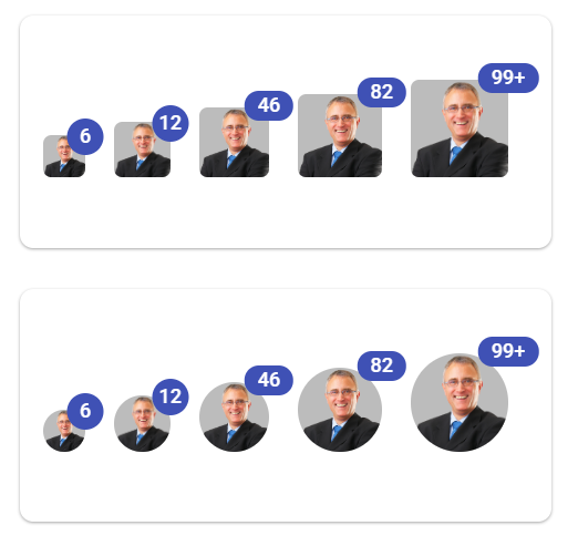
NOTE