Example of Horizontal Card in ASP.NET Core Card Control
This sample demonstrates card rendering with horizontal layout. Based on the horizontal structure, product card is shown with detailed information.
DEMO
SOURCE
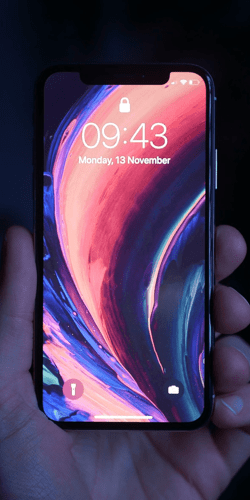
iPhone X
Marketed by Apple Inc
The iPhone X has a 5.8-inch diagonal OLED color-accurate screen, has two cameras on the rear. One is a 12-megapixel with
support for face detection. It is capable of capturing 4K video at 24, 30 or 60 frames per
second. It supports Qi-standard wireless charging.

Philips Trimmer
Philips trimmers are designed to last longer than 4 ordinary trimmers and DuraPower Technology which optimizes power.


Canon 135mm
The fastest 135mm telephoto lens in its class. Two UD-glass elements correct secondary spectrum for outstanding sharpness and color.
By default, card elements are stacked one after another vertically. You can customize the card with specific direction by adding e-card-horizontal to align elements horizontally. Using e-card-stacked class, you can split the horizontal layout with a stacked element on left or right of the card.
More information about Card can be found in this documentation section.